![](https://cdn.myportfolio.com/16e9fdad-a274-4fe2-9d49-8a9851b65be4/0ef8119c-d37f-4056-8a38-355cfbbe8f56_rw_1920.png?h=3e9d746e899986d3ce728b5b021e5202)
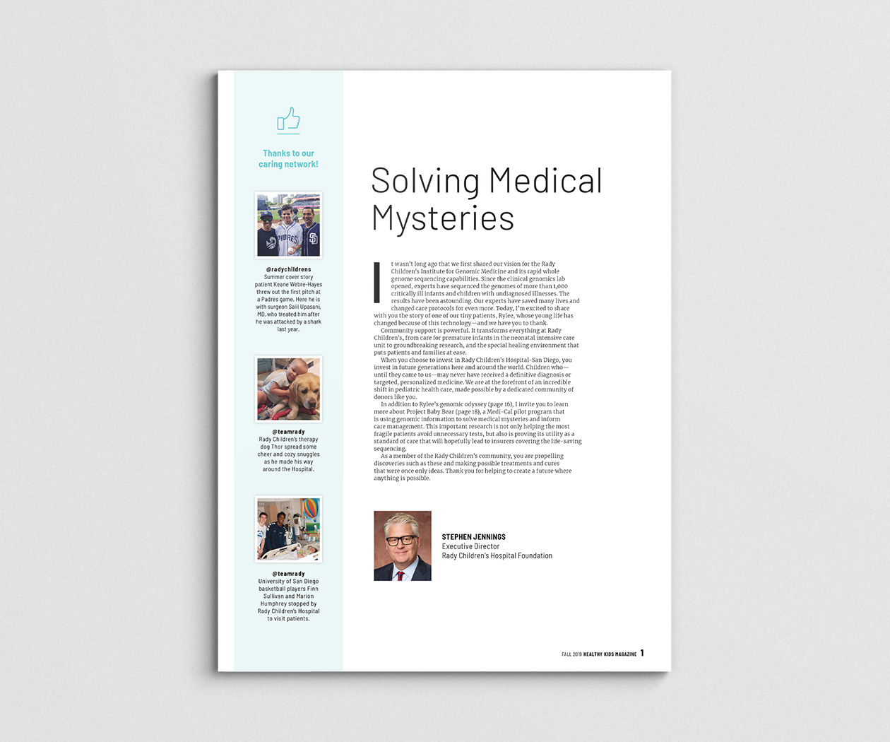
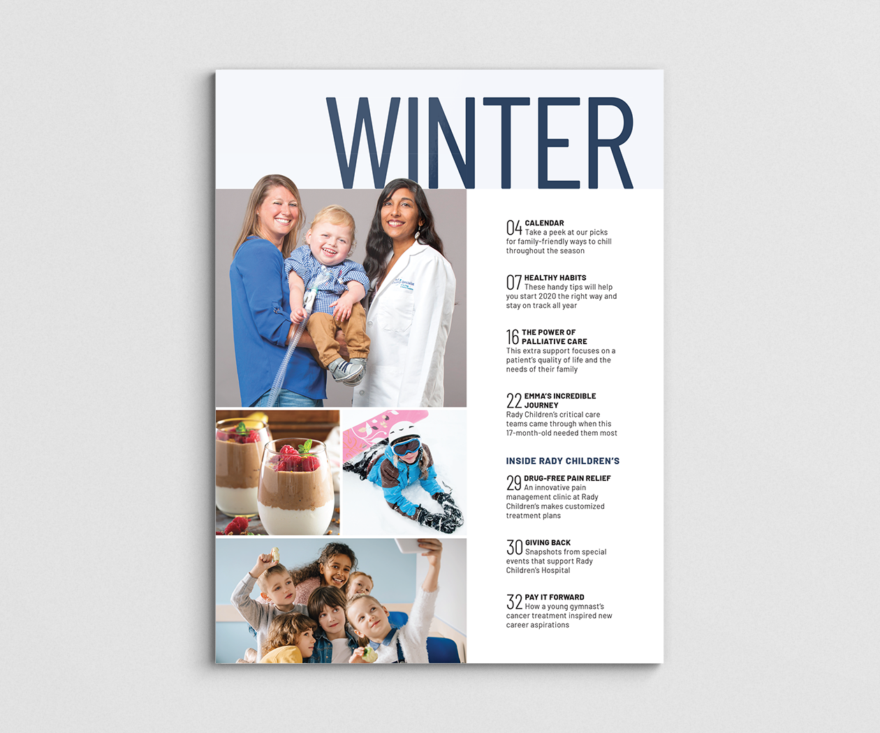
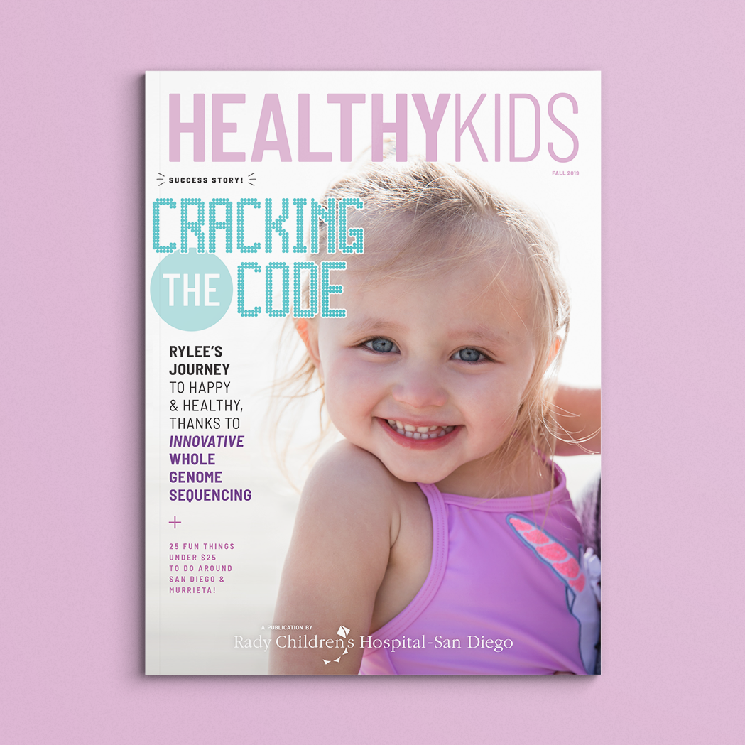
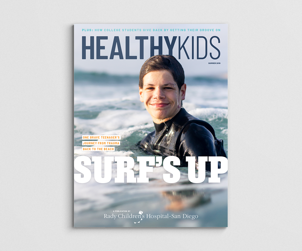
The rebrand included creating a new masthead as seen above.
![](https://cdn.myportfolio.com/16e9fdad-a274-4fe2-9d49-8a9851b65be4/ed9614b8-6f88-41ad-a904-b2a97129a049_rw_1920.png?h=65d00efd1bf367dd5d789c4b1b384914)
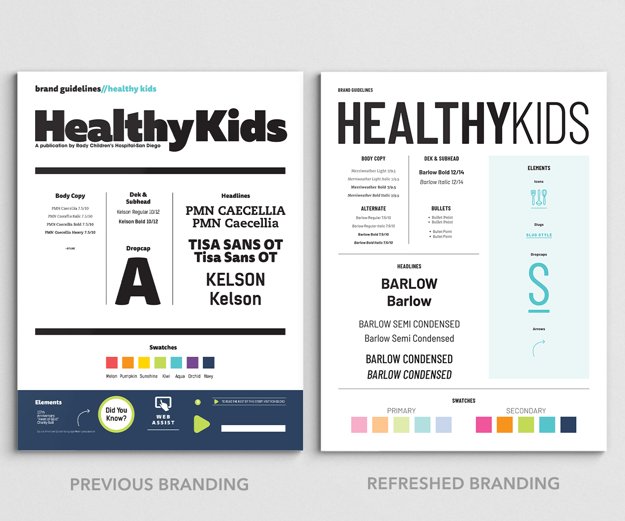
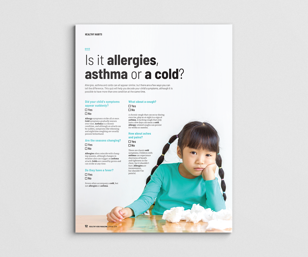
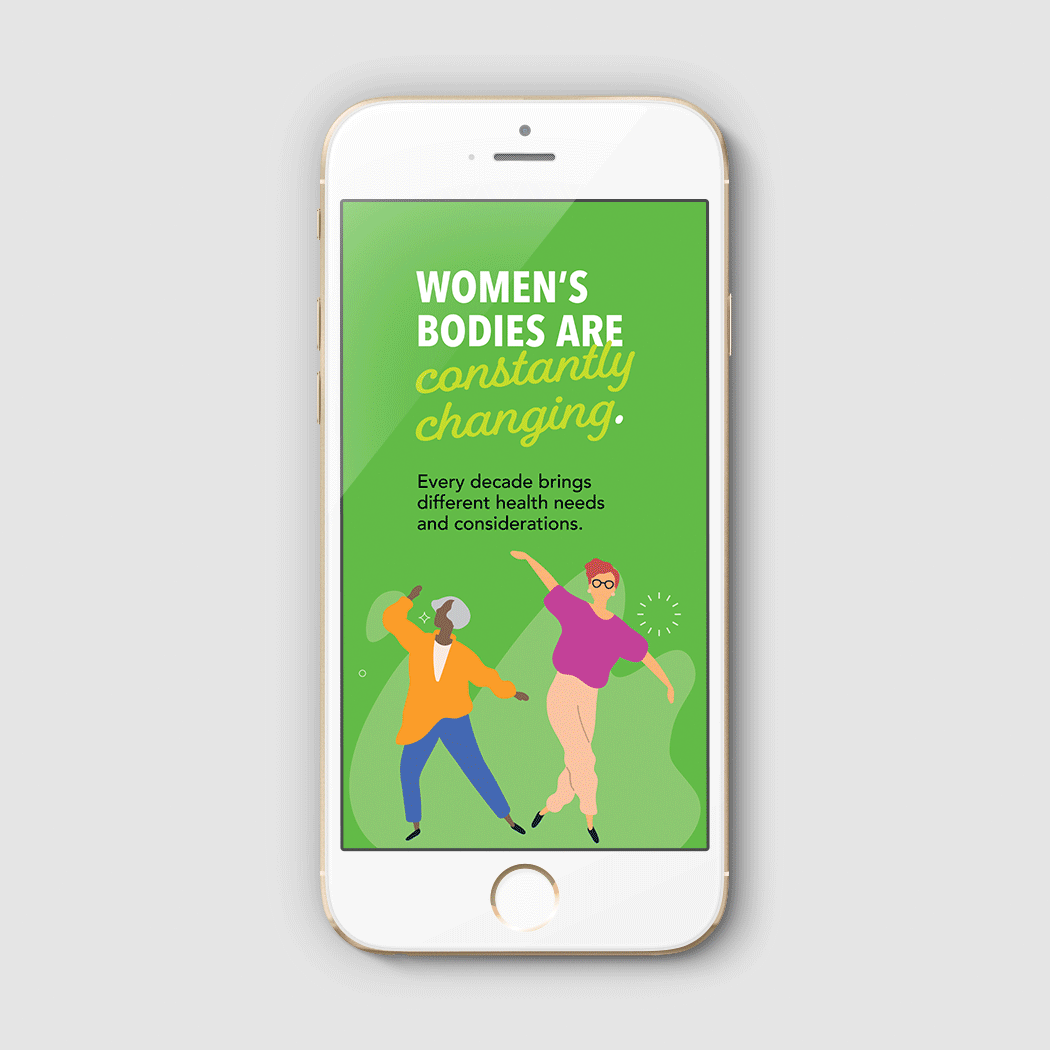
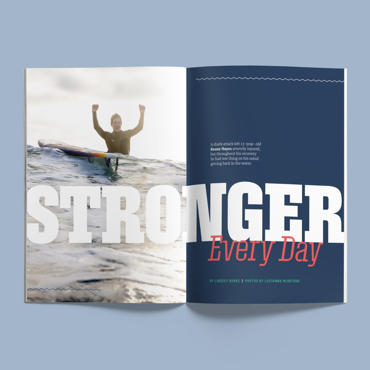
The client's main goal for the design refresh was to give the publication a more ‘mature’ look. This included dropping the ’bubbly’ fonts from the original branding in favor of sleeker fonts. I also narrowed down the color palette and primarily used softer tones.
![](https://cdn.myportfolio.com/16e9fdad-a274-4fe2-9d49-8a9851b65be4/2b087f59-af10-40b6-8399-c052de242e7b_rw_1920.png?h=874772f4c10cdeec21b07b898cc5c0ea)
![](https://cdn.myportfolio.com/16e9fdad-a274-4fe2-9d49-8a9851b65be4/48a64144-cfff-424d-8feb-0d841423728e_rw_1920.png?h=36cf904884d1de17a203a60864329b15)
![](https://cdn.myportfolio.com/16e9fdad-a274-4fe2-9d49-8a9851b65be4/4649d750-d00f-4e58-9bb9-fccc6073a318_rw_1920.png?h=a4c555817c4341bfeb2810ccd9123246)
![](https://cdn.myportfolio.com/16e9fdad-a274-4fe2-9d49-8a9851b65be4/16c3c3e2-dbd6-445b-b202-f4ef230c3dd4_rw_1920.png?h=915288daf0edf374cc2d5fcbab95a1f0)
![](https://cdn.myportfolio.com/16e9fdad-a274-4fe2-9d49-8a9851b65be4/6f061f27-eada-4076-9b2b-e2957f0f0ecb_rw_1920.png?h=ccee78138753f996159df0b74366f8e3)